
Found this in my downloads folder.
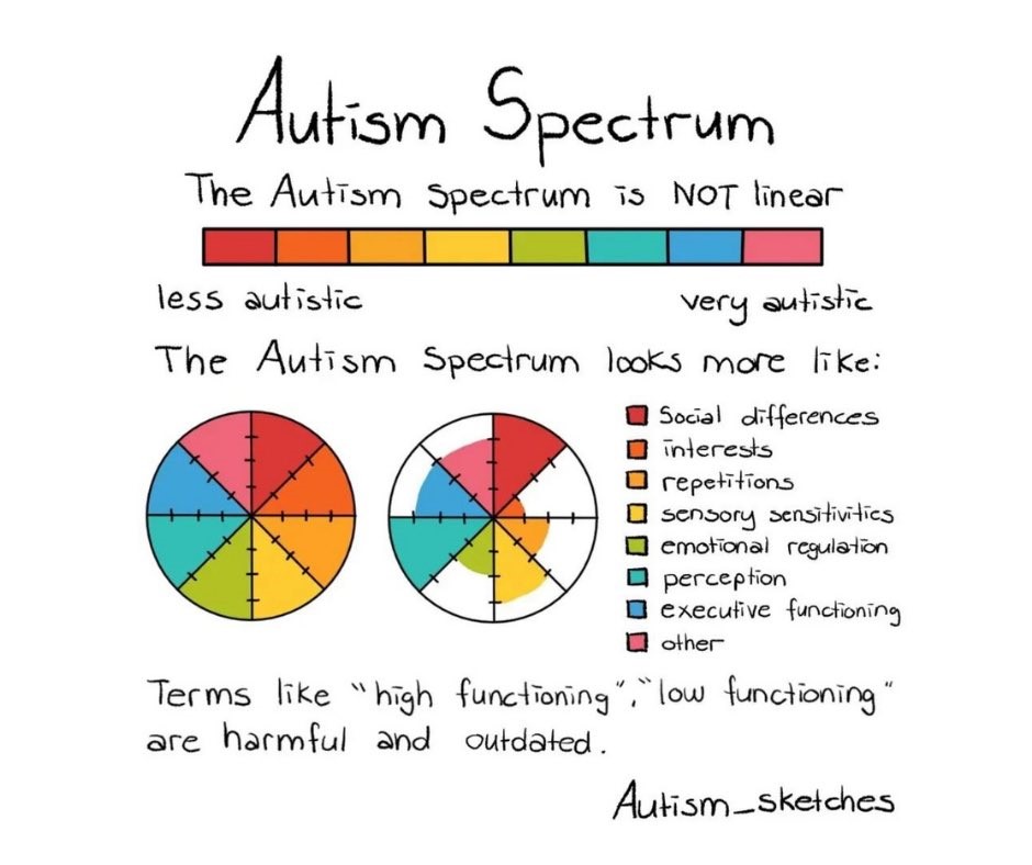
I liked it at the time and I like it now. It makes me think of how bad I am at thinking in wheels/spokes rather than lines. We need to think in wheels and “pies” and so on.
The planetary limits dashboard people do a decent job,
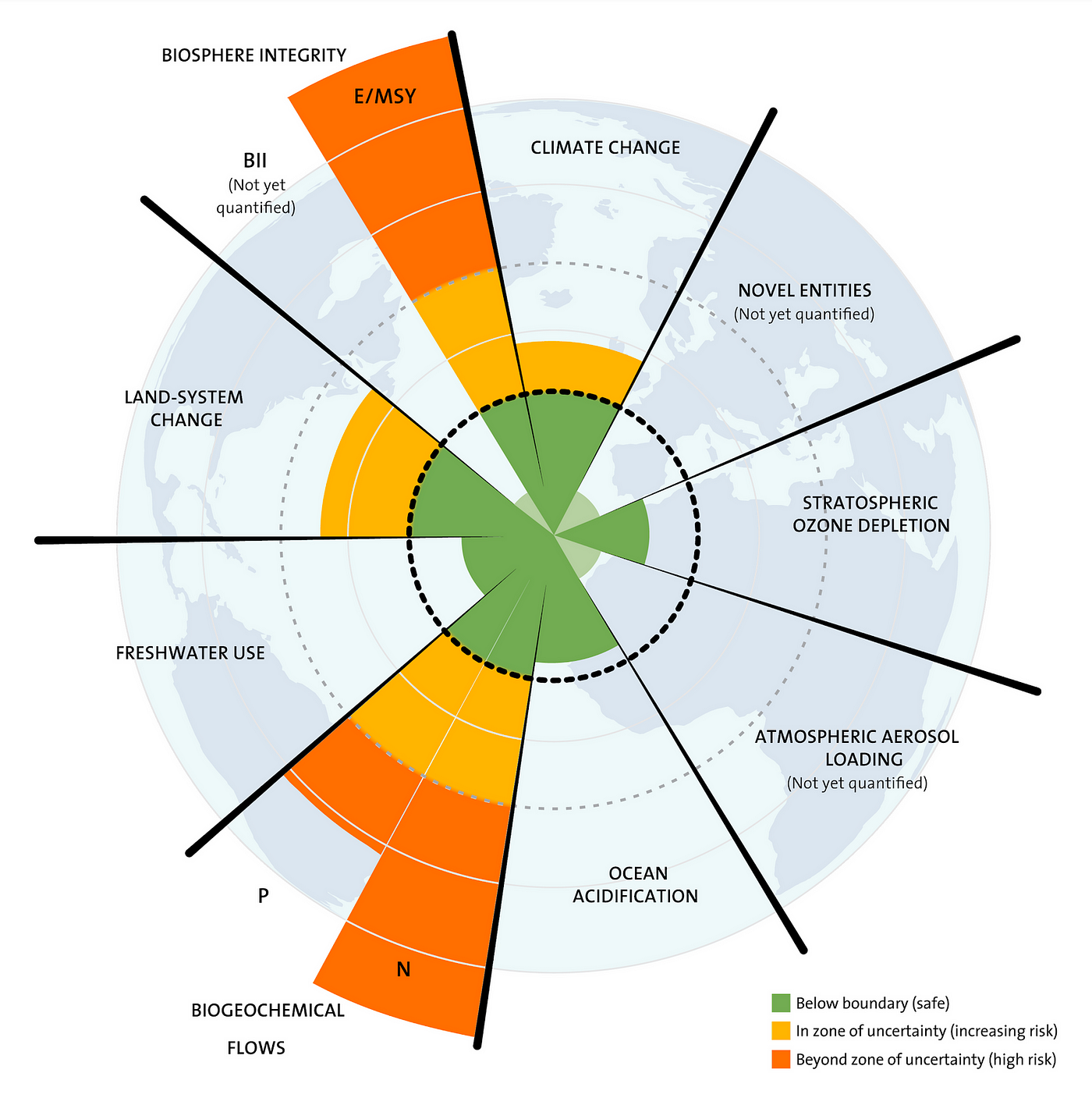
Here’s a excerpt, from a section where the coordinator of the international Planetary Boundaries Research Network critiques the chart. She doesn’t pull her punches:
Cornell’s list of criticisms is long — that the picture and its caption equates risk and uncertainty, that the traffic light colours create a muddle between “uncertainty about variability in biophysical processes” and “risk to people”, that the yellow zone throws together all kinds and sources of uncertainty, that the split wedges look half as important as the full wedges, that some people interpret it as a pie chart, that others think there must be meaning in the sequencing of the boundaries, and particularly that that different wedges don’t have a common metric but many people think they do.
Hmmm. As per the old Wobbly song – “you’ll get piechart in the sky when you die…”

Leave a comment